


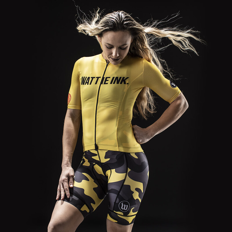
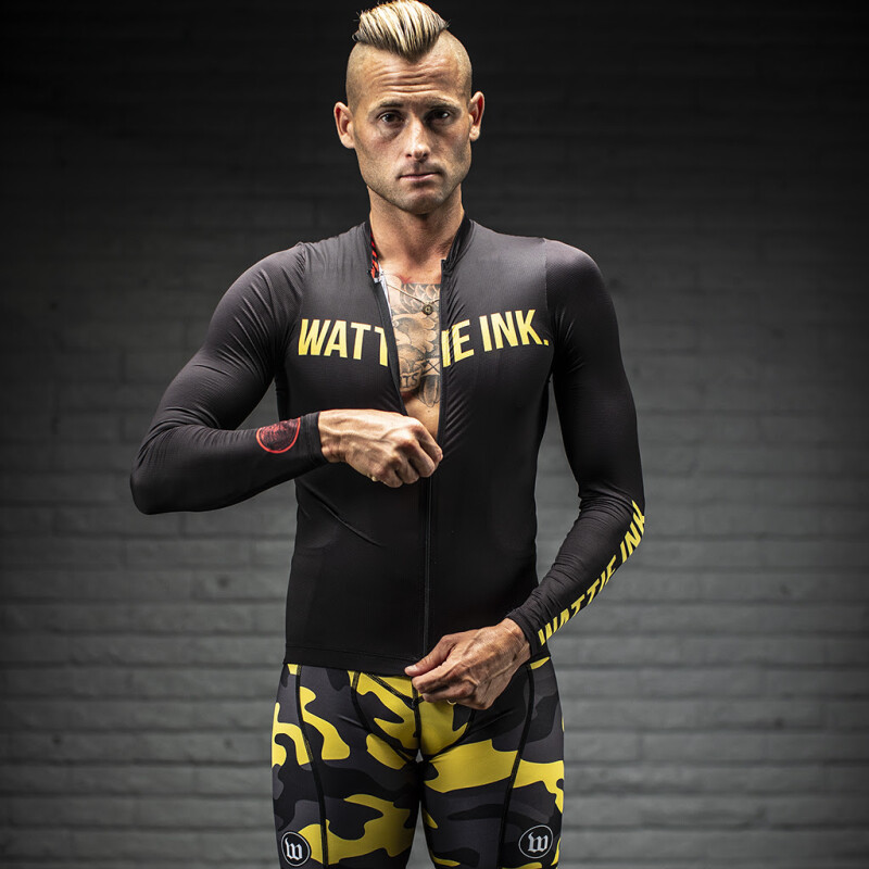
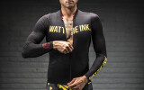
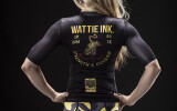
Wattie Ink. (United States) - "We aimed for something simple, but bold, that you could mix and match with a simple black short, or that you could couple with the yellow-and-black camo for a really assertive look.
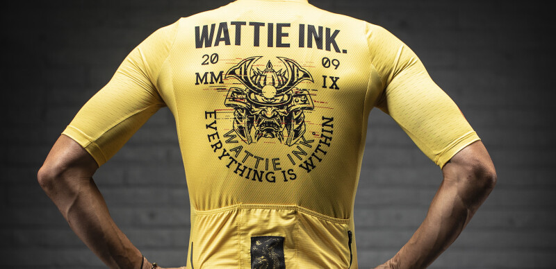
The tiger stands for strength and courage, and the samurai for fierceness.
We wanted something that would make the athlete feel those qualities when he or she pulled on the kit, and that's one of the things I like about this design: it's simple and quiet, but the colors are confident. It's sort of the way we imagine racing and training—you don't need to talk a lot, but when you show up, you show up big." - Sean "Wattie" Watkins.


Interested? Submit your enquiry using the form below:
Only available for registered users. Sign In to your account or register here.